Teradata: Brand Refresh
Identity Design + Brand Refresh
TEAM : Interbrand, NYC
Executive Creative Director : Mike Knaggs, Penelope Davis
Client Management: Hanna Mon
Design : Liora Cher, Sukanya Bose, Bradley Metoyer
Teradata, a leader in cloud analytics, needed to shift perception. Once seen as expensive and outdated, the brand no longer reflected its ambition to lead in the cloud space. The new strategic platform, Be Business Brave, called for a bold identity that aligned with this future-focused direction.
Guided by customer and industry insights, we defined a clear purpose: to inspire the confidence to elevate human potential. The existing brand identity wasn’t keeping pace. It lacked the energy, relevance, and modernity that the new strategy demanded.
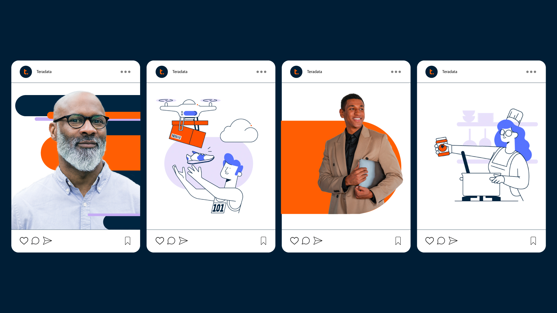
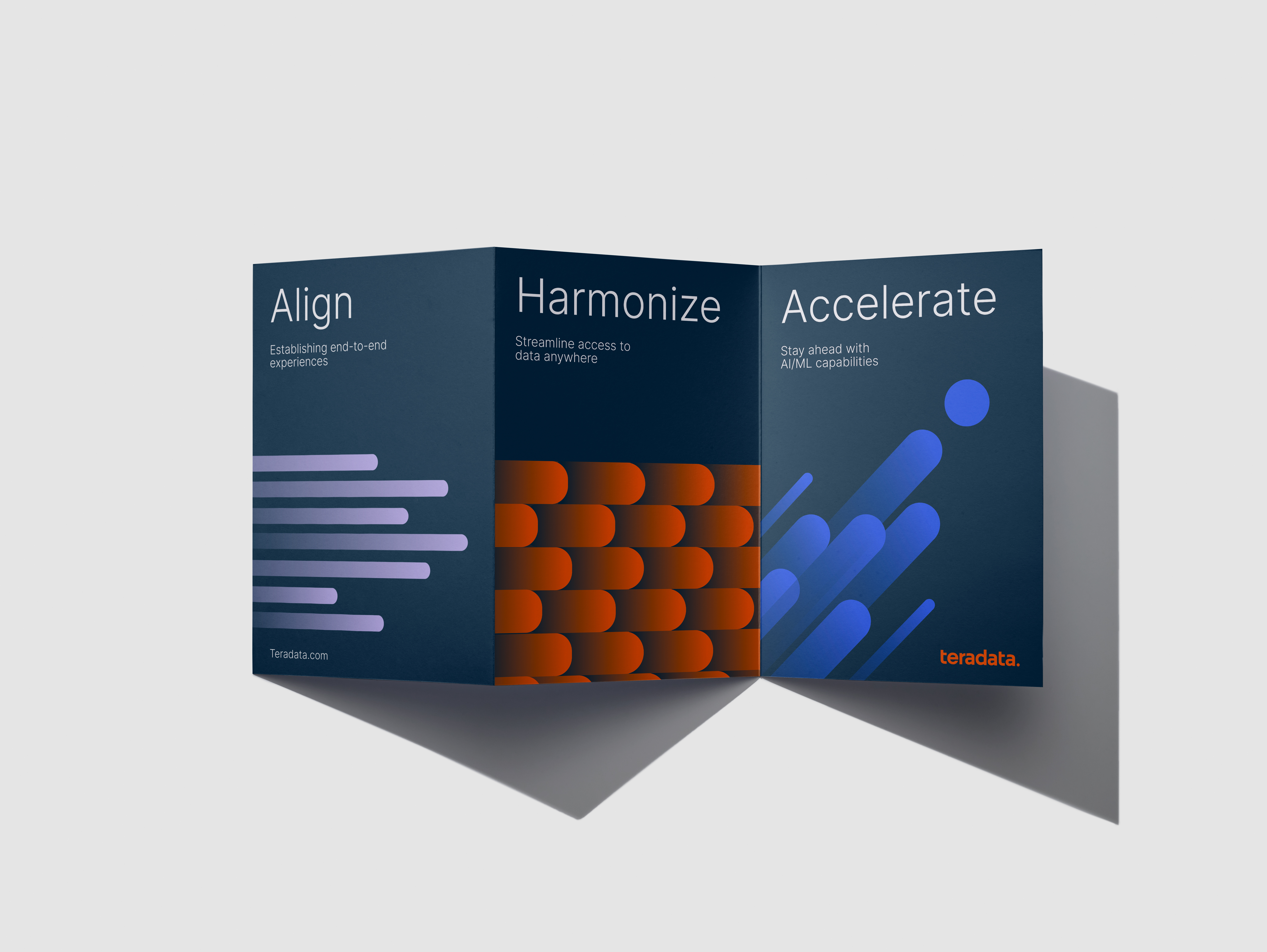
We refreshed the wordmark to feel more dynamic while preserving brand equity. A new graphic system was introduced, centered around a bold dot motif that signaled innovation and momentum. Photography and illustration styles were updated to tell more human and impactful stories that highlight Teradata’s influence across industries.
This was a collaborative effort across disciplines. I led the development of the typography system, refined the color palette, and created the signature dot-based patterns that visually express Teradata’s evolving and connected approach.
TEAM : Interbrand, NYC
Executive Creative Director : Mike Knaggs, Penelope Davis
Client Management: Hanna Mon
Design : Liora Cher, Sukanya Bose, Bradley Metoyer
Teradata, a leader in cloud analytics, needed to shift perception. Once seen as expensive and outdated, the brand no longer reflected its ambition to lead in the cloud space. The new strategic platform, Be Business Brave, called for a bold identity that aligned with this future-focused direction.
Guided by customer and industry insights, we defined a clear purpose: to inspire the confidence to elevate human potential. The existing brand identity wasn’t keeping pace. It lacked the energy, relevance, and modernity that the new strategy demanded.
We refreshed the wordmark to feel more dynamic while preserving brand equity. A new graphic system was introduced, centered around a bold dot motif that signaled innovation and momentum. Photography and illustration styles were updated to tell more human and impactful stories that highlight Teradata’s influence across industries.
This was a collaborative effort across disciplines. I led the development of the typography system, refined the color palette, and created the signature dot-based patterns that visually express Teradata’s evolving and connected approach.