Fight for Kindness Posters
Poster design+Art Direction
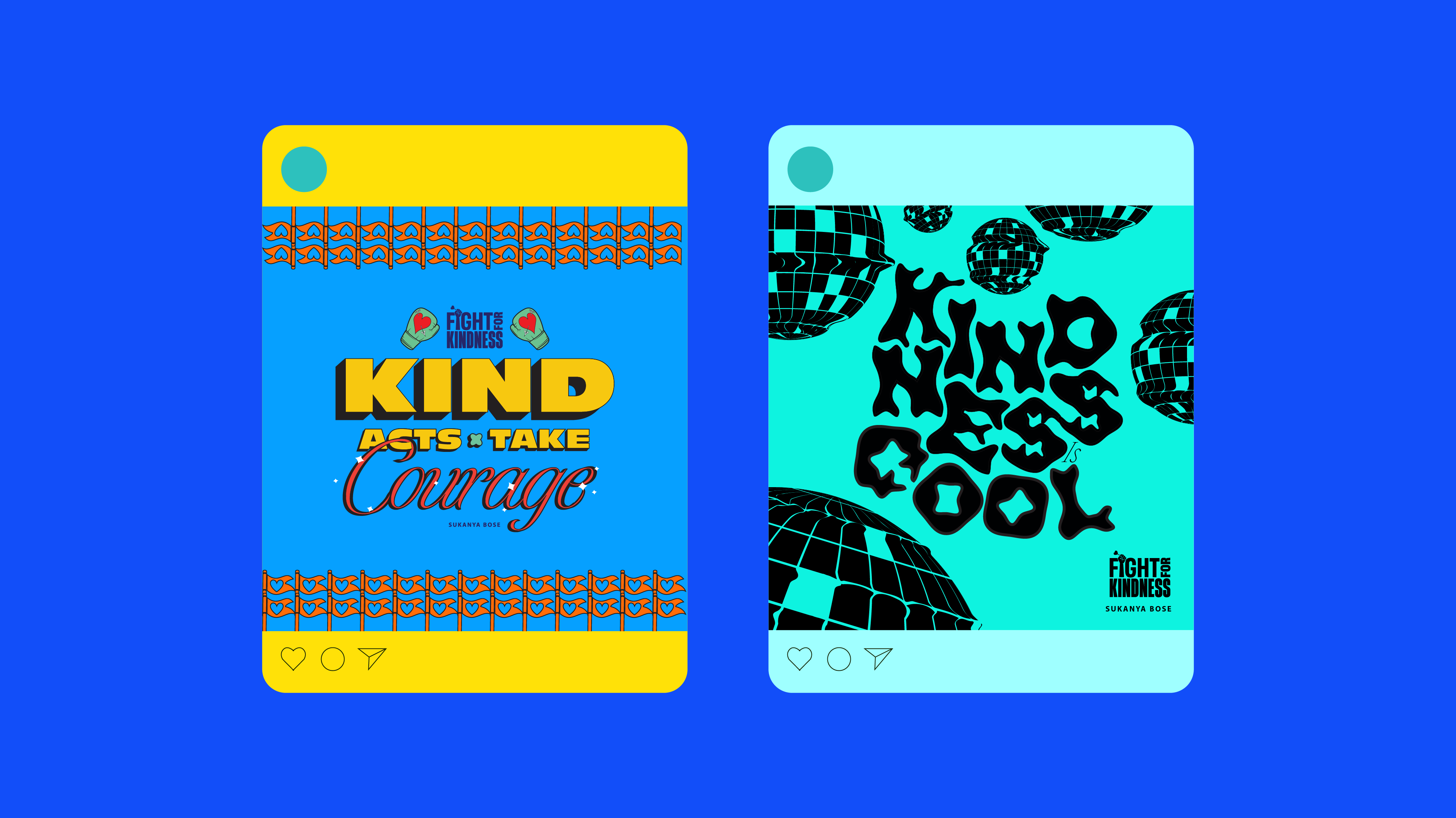
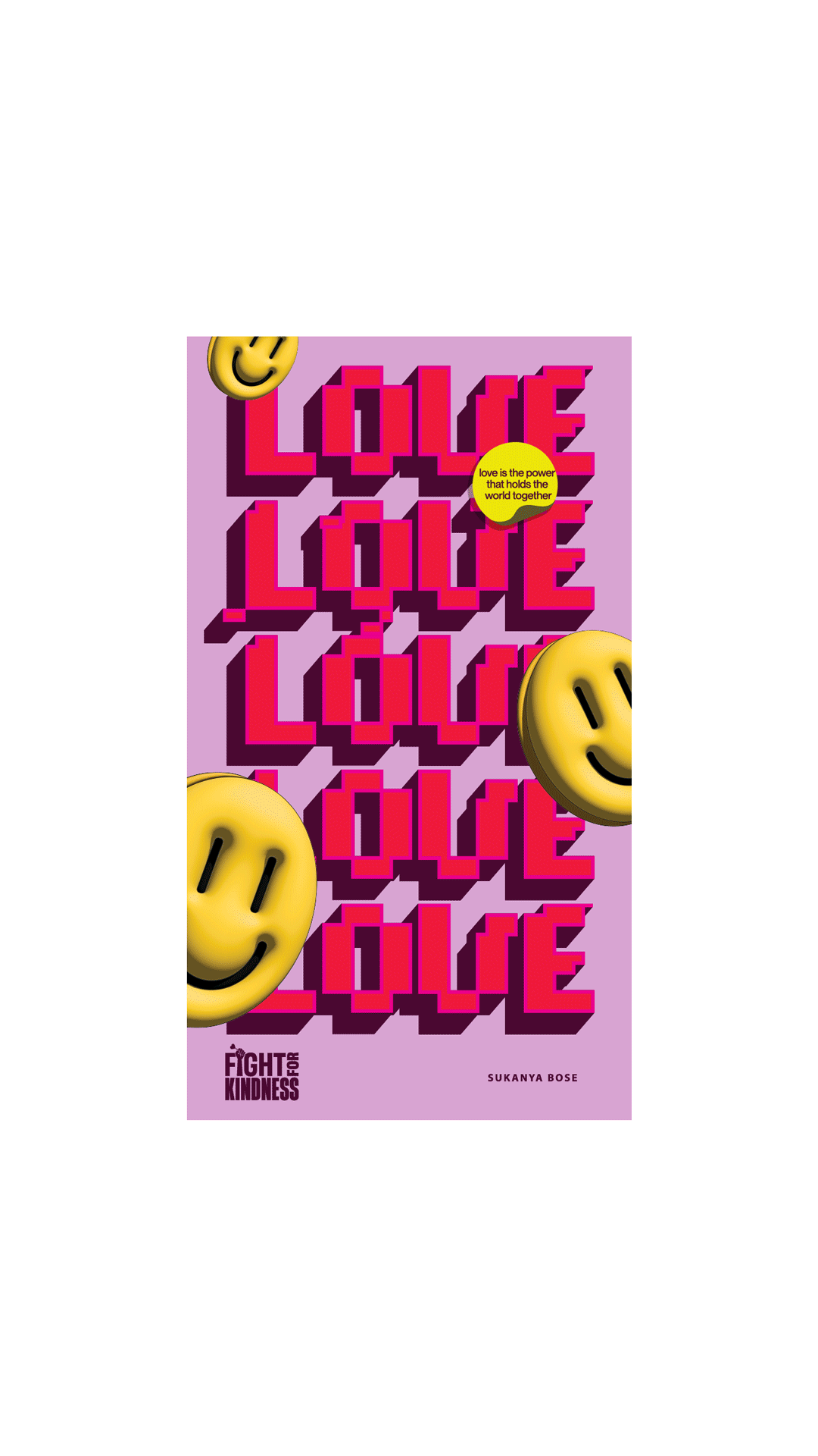
These posters were made as a contribution to the Fight for Kindness intitiave by Typecampus and Zeta Fonts.
A set of 5 posters were selected to contribute to a digital gallery, a book and a mutli-city exhibition in cities like Los Angeles, Rome, Egypt, Milan, Berlin and the United Kingdom.
Buy the book here


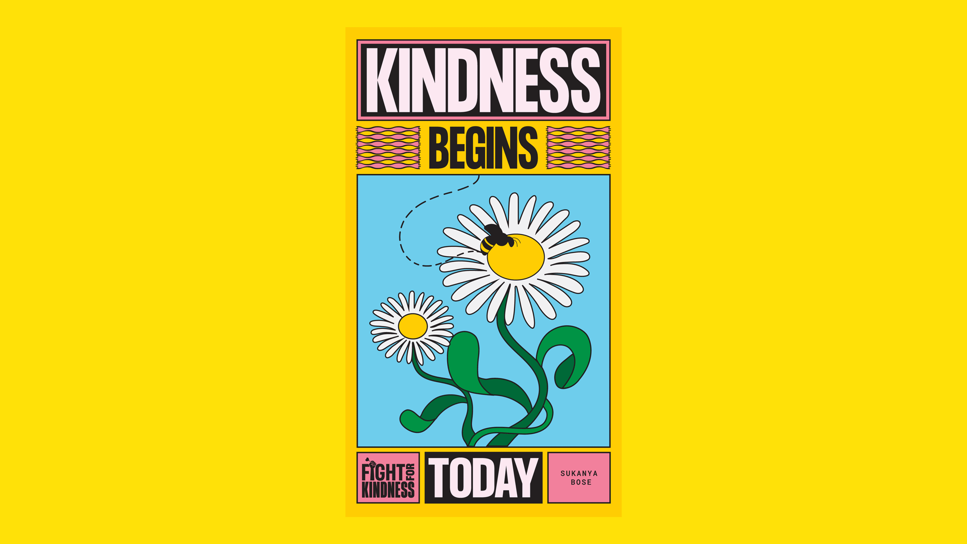
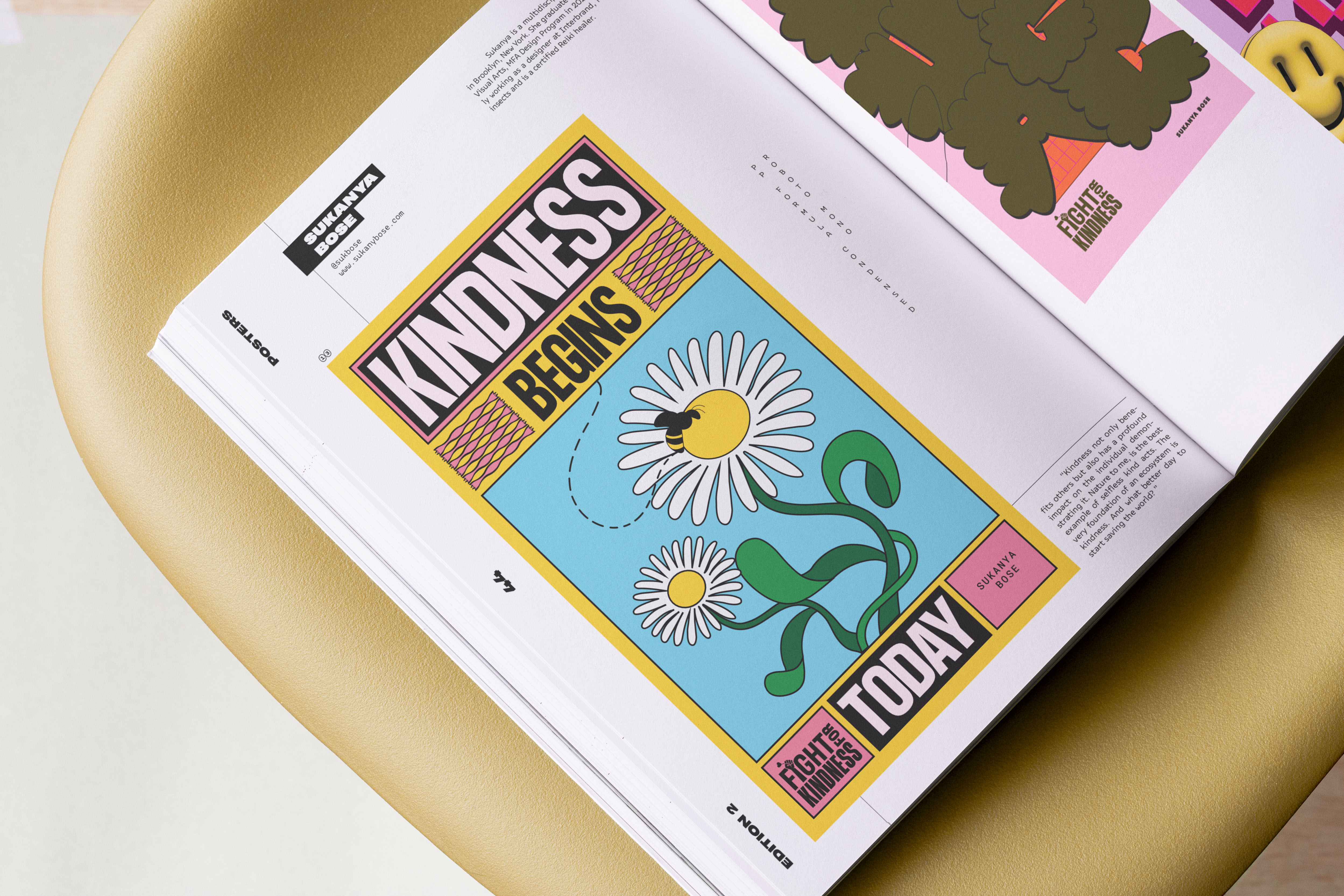
Fight For Kindness is a global call to action, urging creatives to weave hope and positivity through visual typographic messages. This non-profit initiative, aims to reintroduce compassion and altruism into our daily lives. Selected participants contribute to a digital gallery, a book, and a multi-city exhibition on World Kindness Day, November 13th.


FTSE Russell
System Design + Brand Refresh
TEAM : Interbrand, NYC
Executive Creative Director : Mike Knaggs
Strategy : Michael Moratta
Client Management: Nicolette Harley
Design : Sukanya Bose, Julia Yu
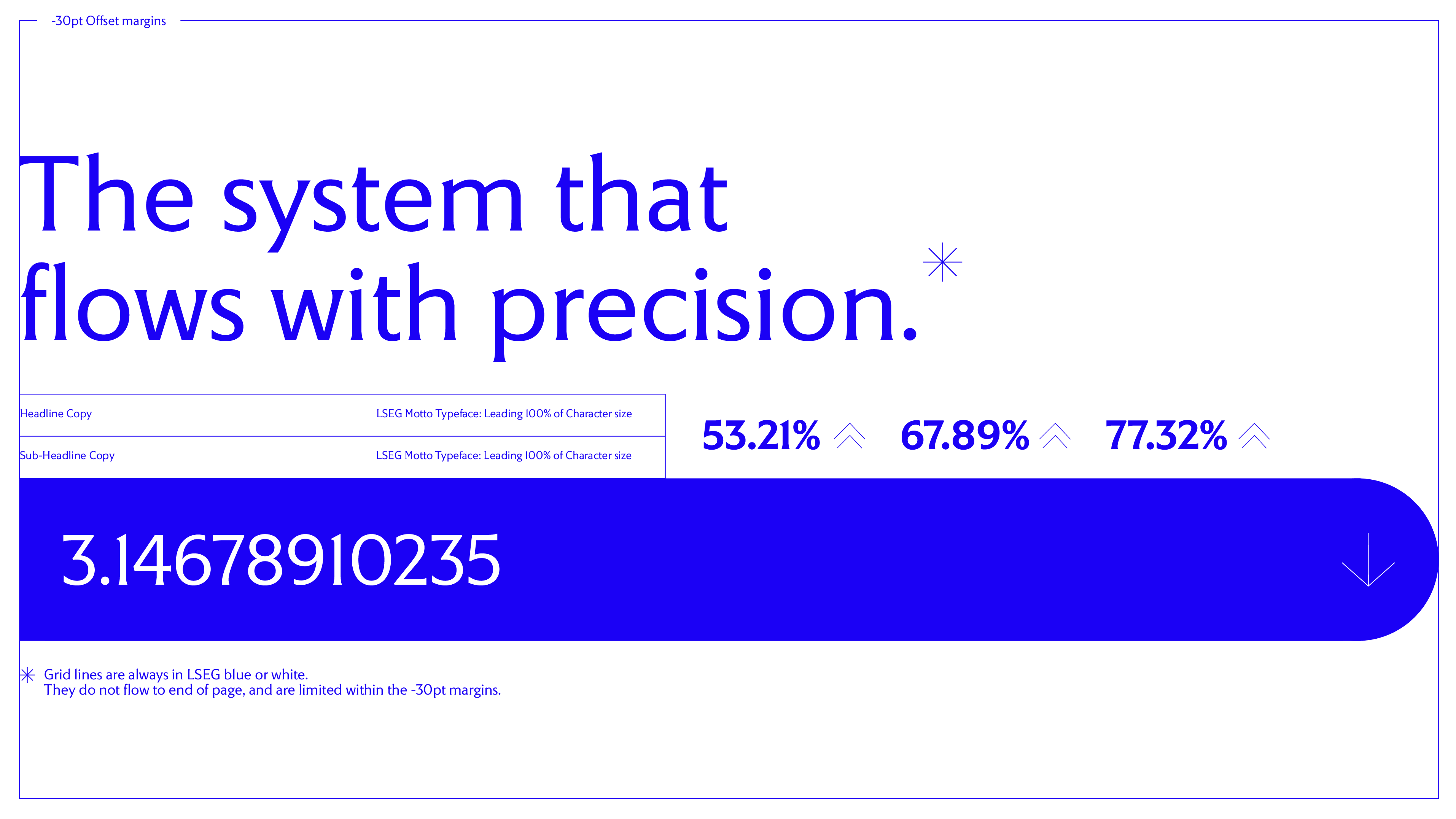
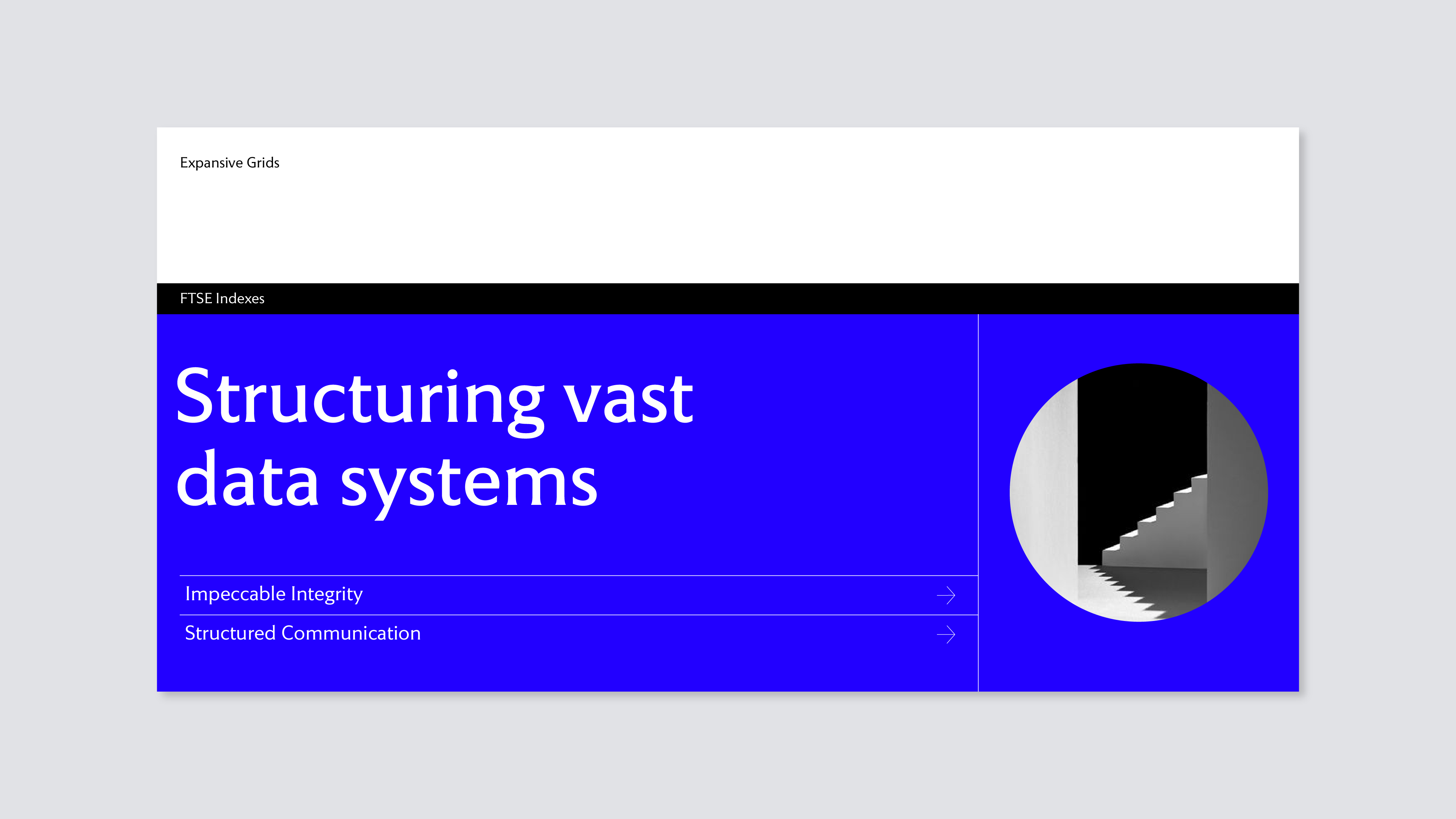
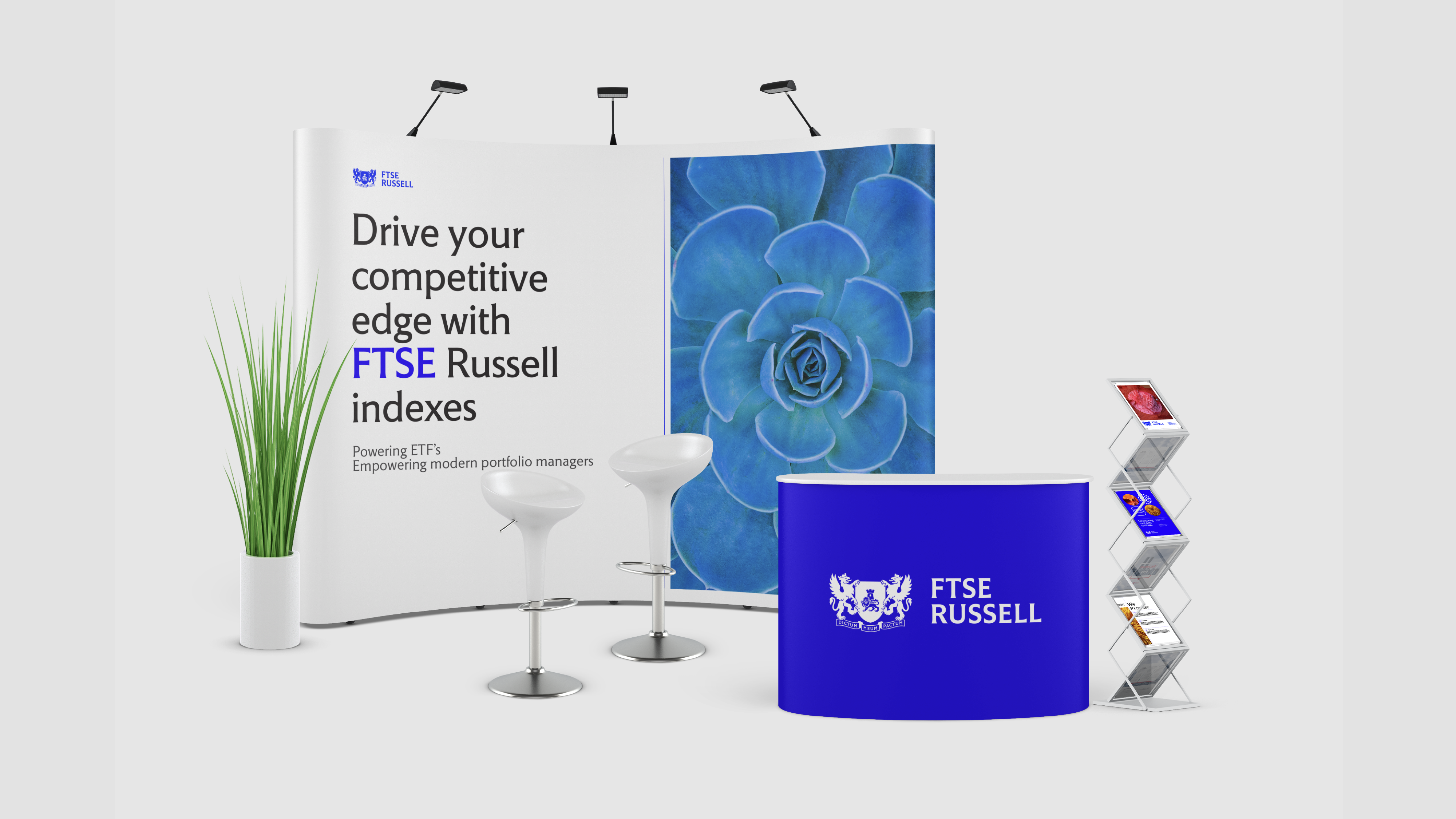
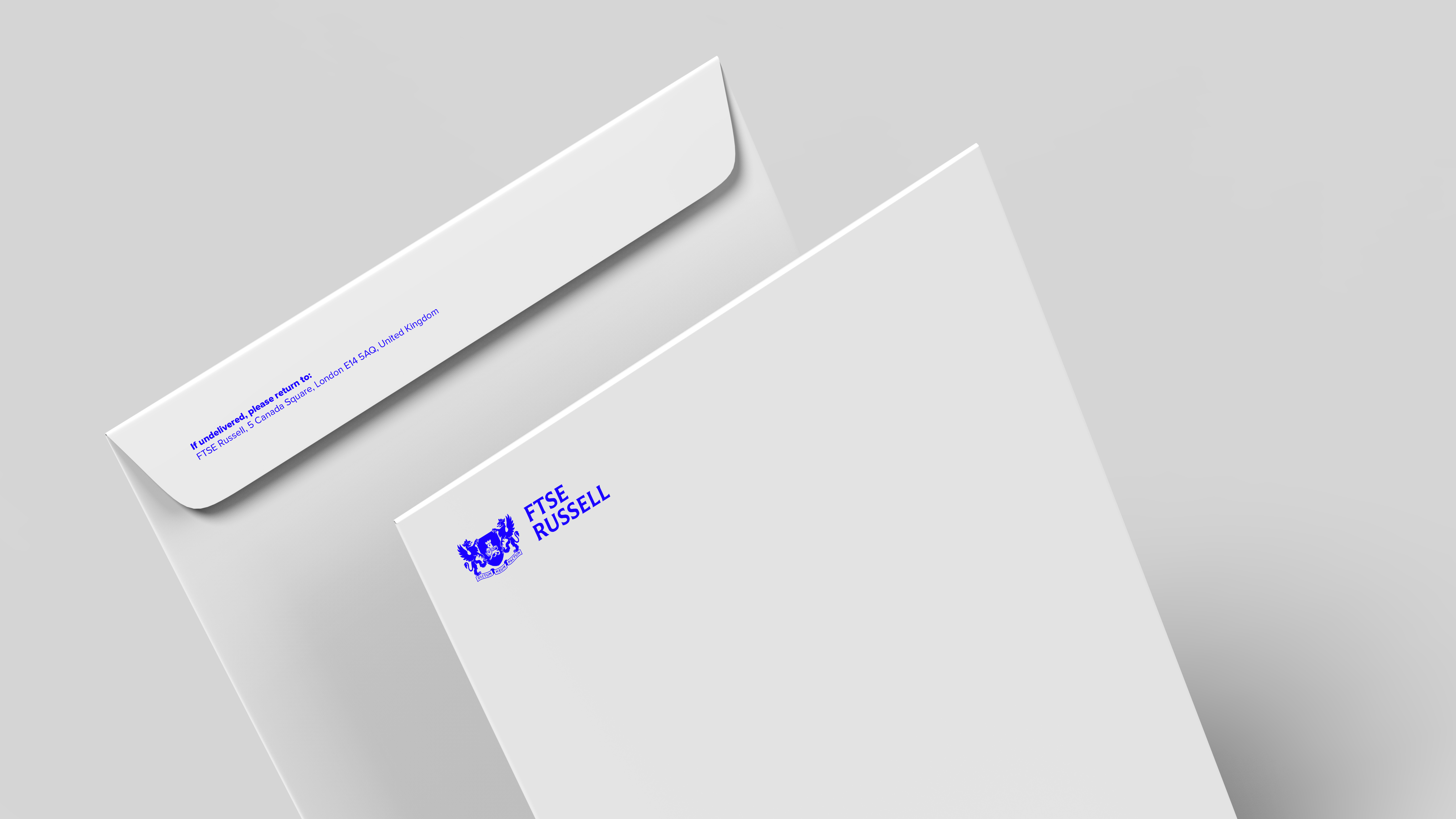
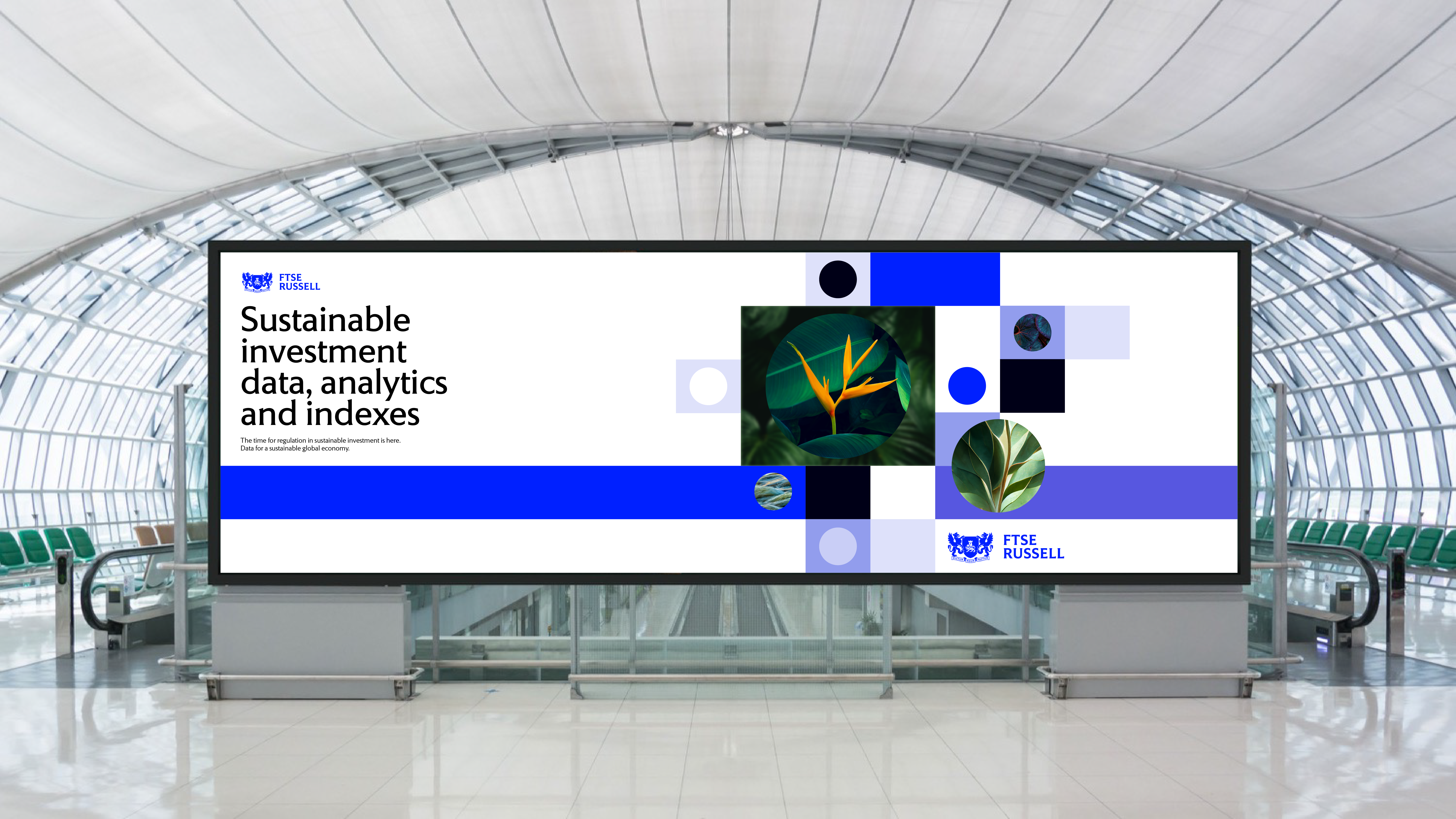
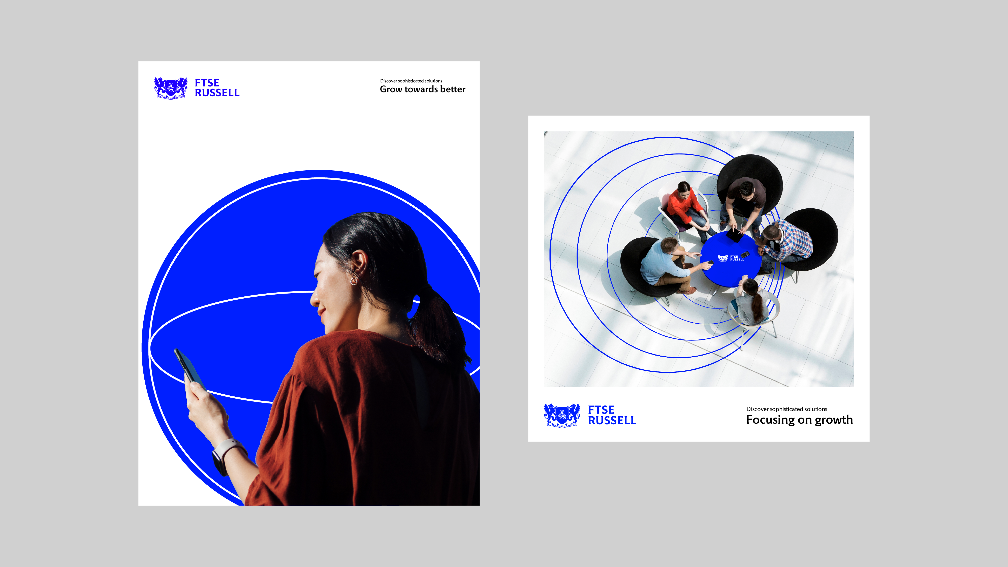
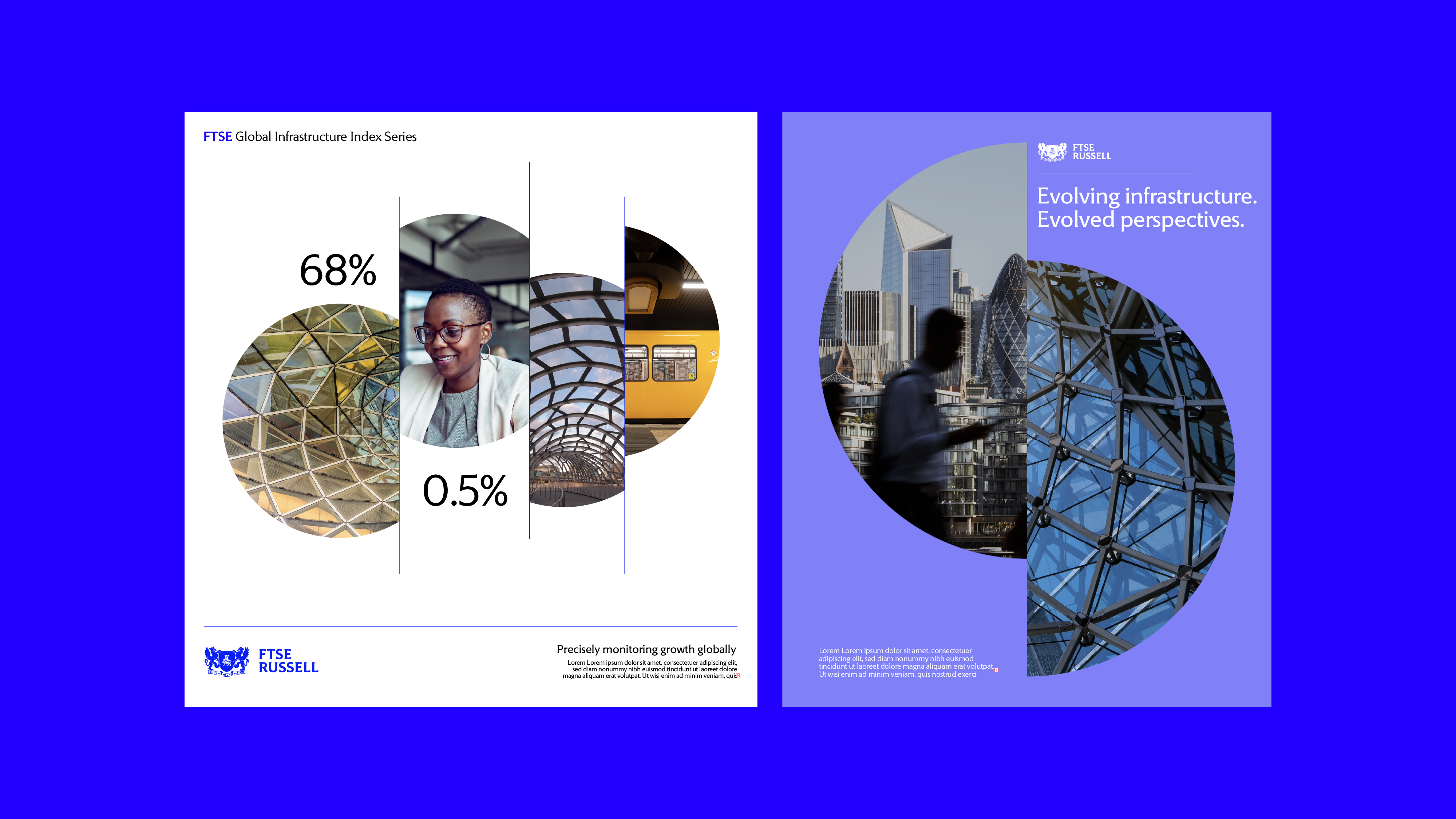
FTSE Russell, a leading LSEG sub-brand known for indexing and financial advisory, faced a fragmented identity that lacked connection to the refreshed broader London Stock Exchange ecosystem. The challenge was to create a bold, standout identity that also aligned seamlessly with LSEG’s visual system.
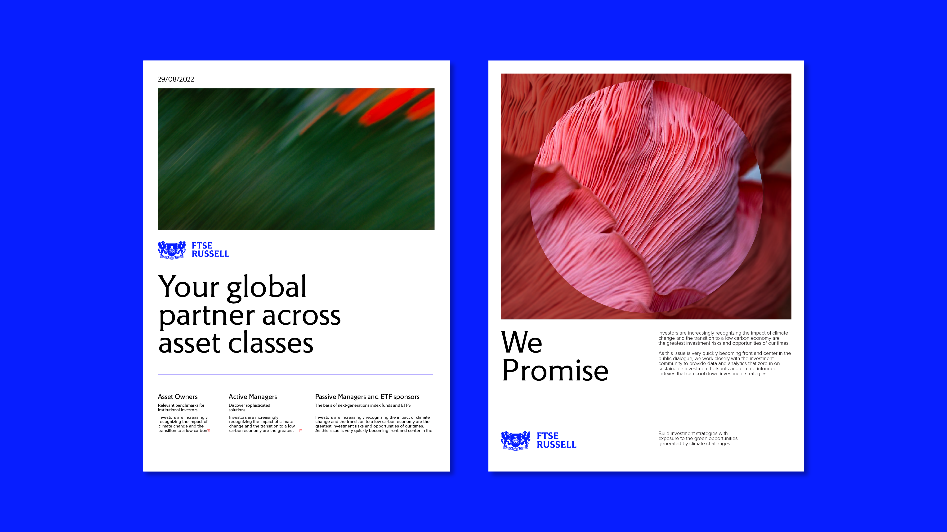
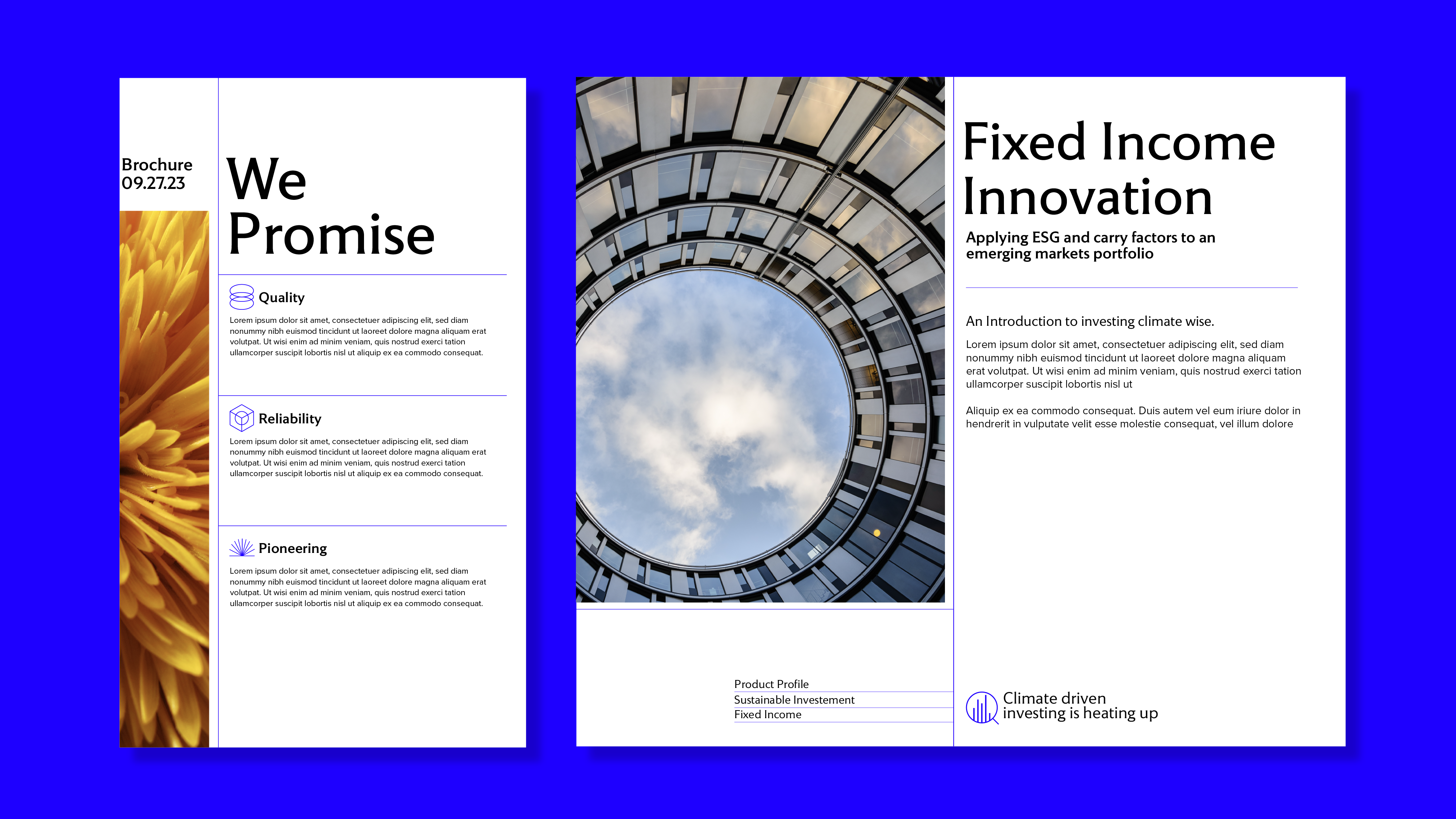
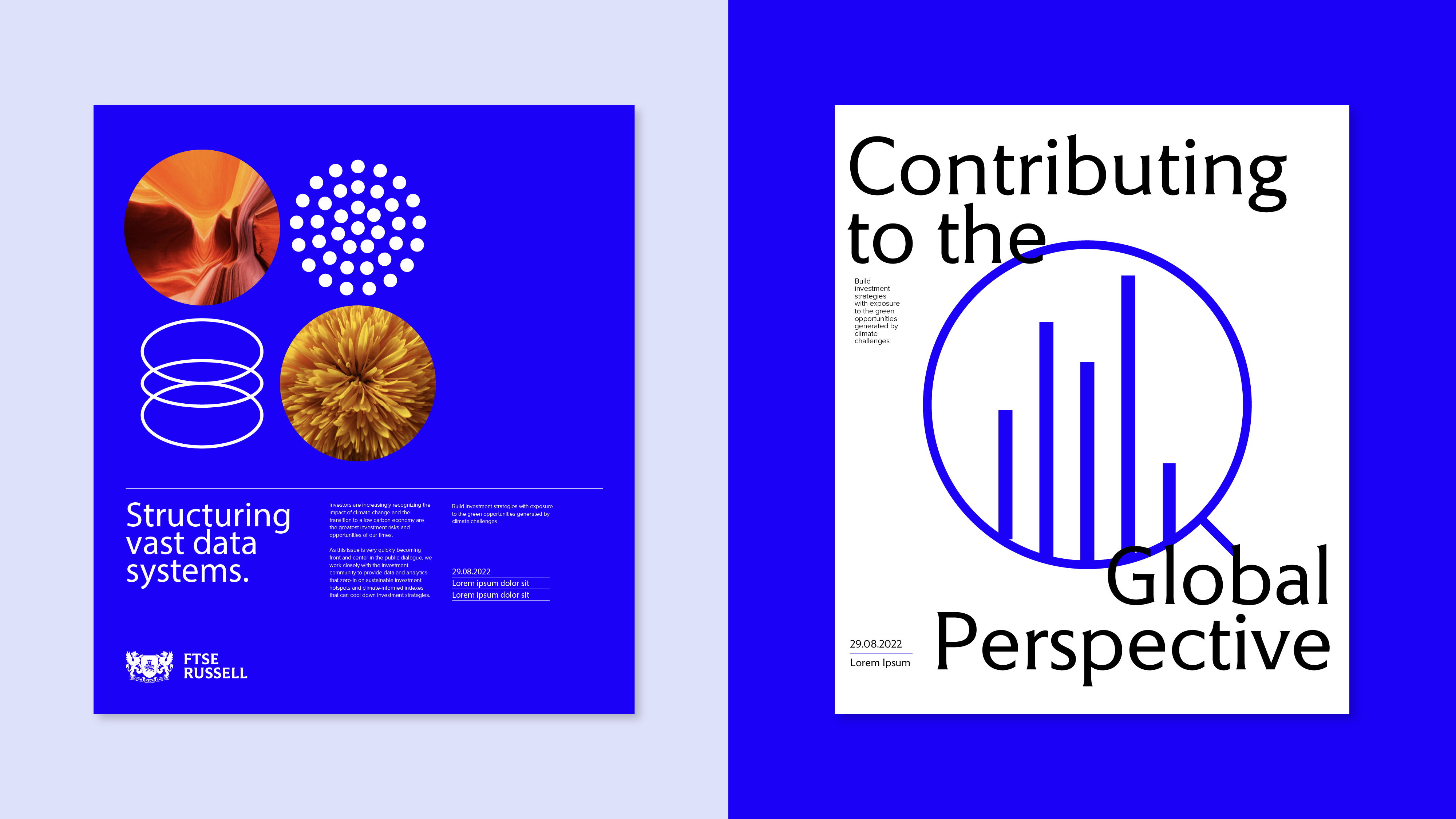
We introduced a modular grid to organize complex data with clarity, retained the brand’s circular equity, and used expressive graphics and expandable illustrations to bring depth and flexibility.
Following the initial concept pitches, the chosen direction was developed through to delivery—defining the layout system, color palette, and typography guidelines. A nature-inspired photography style was championed to introduce warmth and contrast to the brand’s analytical core, helping FTSE Russell feel both precise and human.
TEAM : Interbrand, NYC
Executive Creative Director : Mike Knaggs
Strategy : Michael Moratta
Client Management: Nicolette Harley
Design : Sukanya Bose, Julia Yu
FTSE Russell, a leading LSEG sub-brand known for indexing and financial advisory, faced a fragmented identity that lacked connection to the refreshed broader London Stock Exchange ecosystem. The challenge was to create a bold, standout identity that also aligned seamlessly with LSEG’s visual system.
We introduced a modular grid to organize complex data with clarity, retained the brand’s circular equity, and used expressive graphics and expandable illustrations to bring depth and flexibility.
Following the initial concept pitches, the chosen direction was developed through to delivery—defining the layout system, color palette, and typography guidelines. A nature-inspired photography style was championed to introduce warmth and contrast to the brand’s analytical core, helping FTSE Russell feel both precise and human.


Verizon: Ultra Gaming
Art direction
TEAM : Madwell, NYC
Creative Director : Ryan Howard, Mauricio Galvan
Associate Creative Director : Devin Kharpetian, Katie Mullins
Copy : George Comatas
Design : Cullen Whitmore, Sukanya Bose
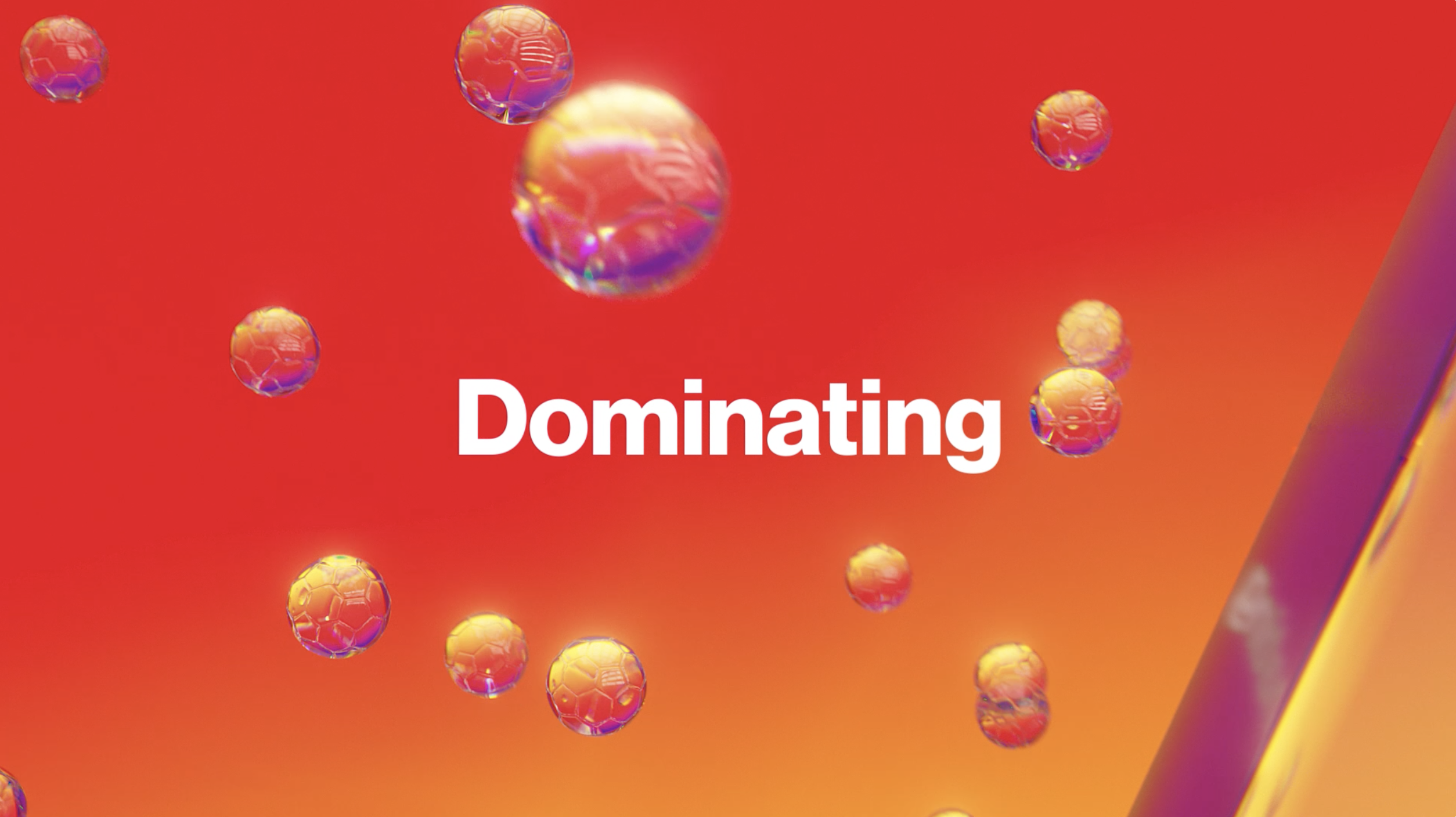
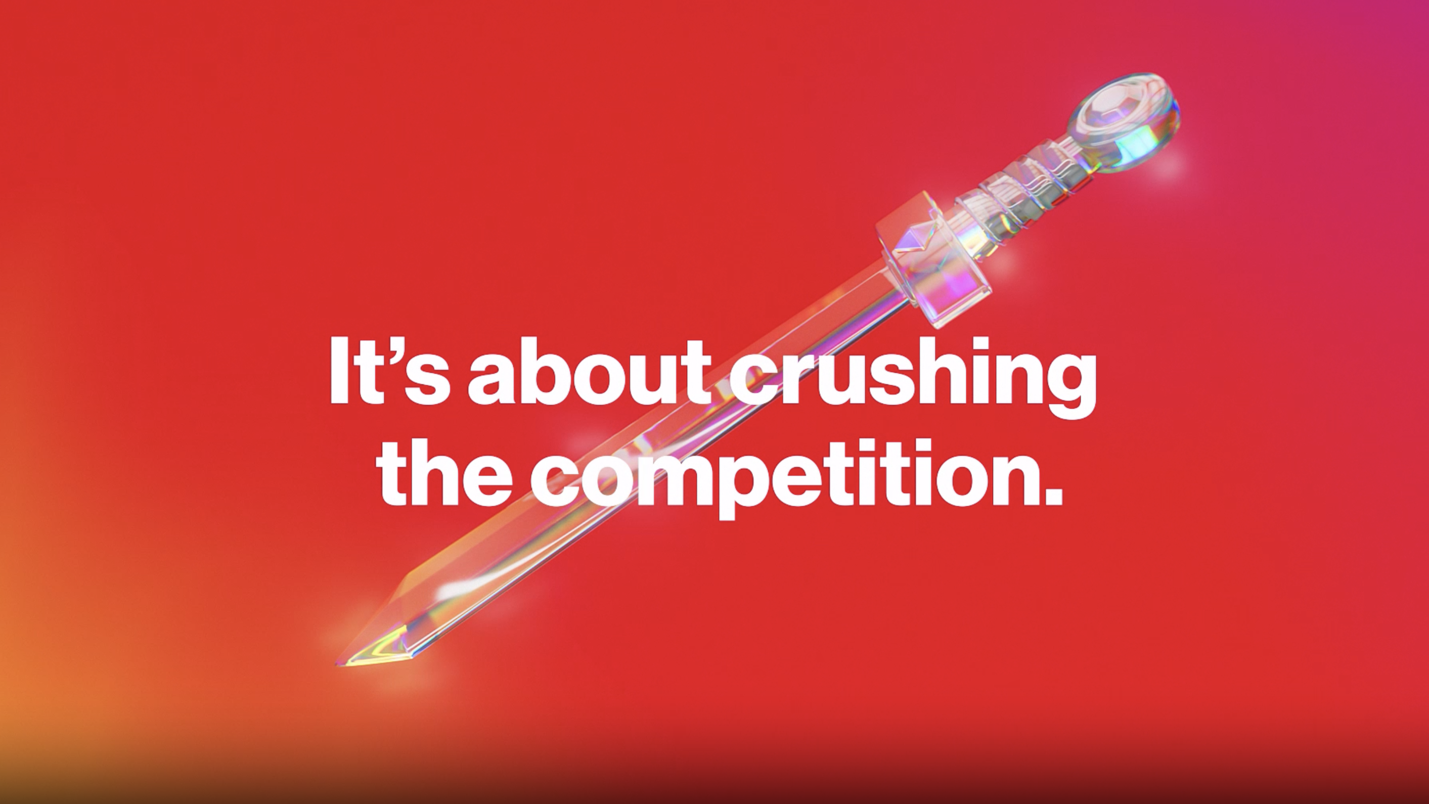
Verizon 5G’s first digital outdoor live video announcing no matter how you game, Verizon is shaking things up with 5G Home.
TEAM : Madwell, NYC
Creative Director : Ryan Howard, Mauricio Galvan
Associate Creative Director : Devin Kharpetian, Katie Mullins
Copy : George Comatas
Design : Cullen Whitmore, Sukanya Bose
Verizon 5G’s first digital outdoor live video announcing no matter how you game, Verizon is shaking things up with 5G Home.


Teradata: Brand Refresh
Identity Design + Brand Refresh
TEAM : Interbrand, NYC
Executive Creative Director : Mike Knaggs, Penelope Davis
Client Management: Hanna Mon
Design : Liora Cher, Sukanya Bose, Bradley Metoyer
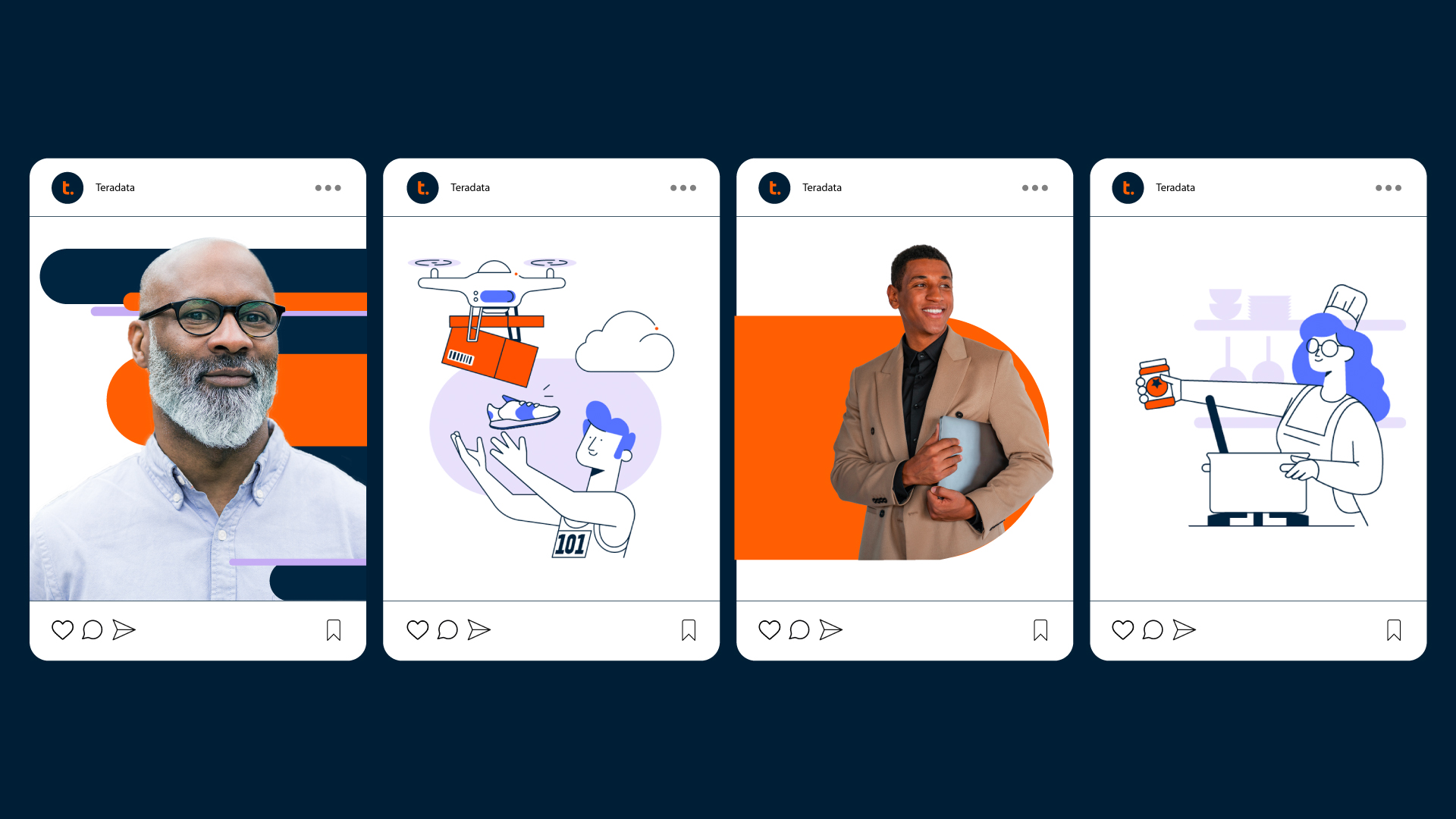
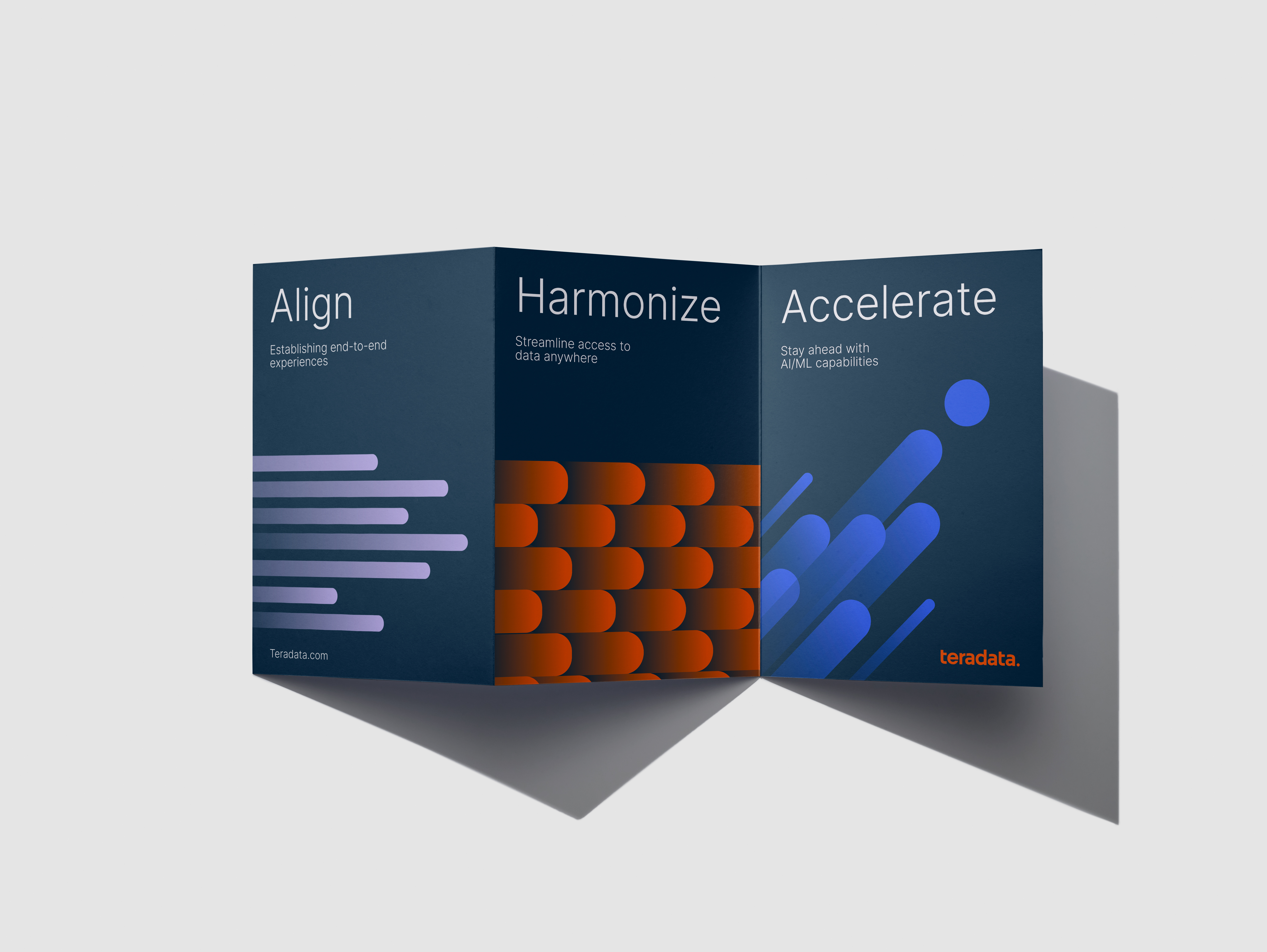
Teradata, a leader in cloud analytics, needed to shift perception. Once seen as expensive and outdated, the brand no longer reflected its ambition to lead in the cloud space. The new strategic platform, Be Business Brave, called for a bold identity that aligned with this future-focused direction.
Guided by customer and industry insights, we defined a clear purpose: to inspire the confidence to elevate human potential. The existing brand identity wasn’t keeping pace. It lacked the energy, relevance, and modernity that the new strategy demanded.
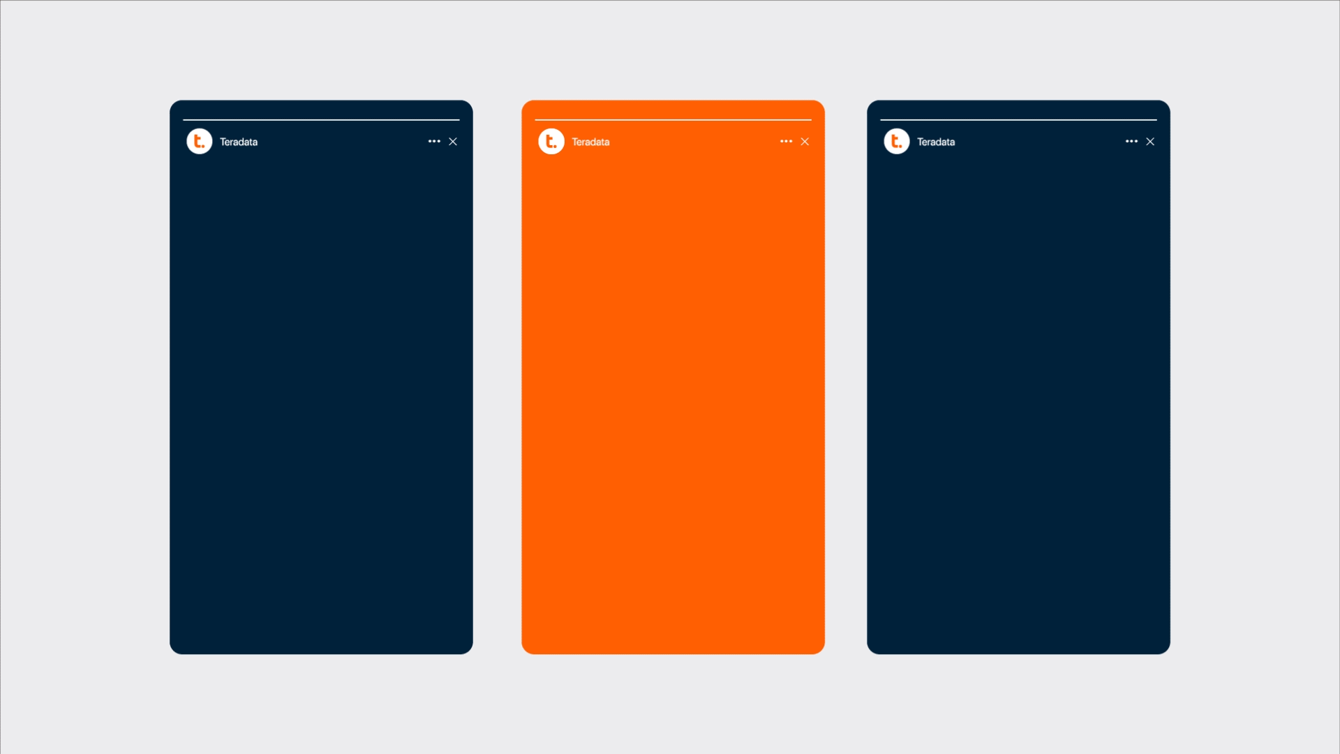
We refreshed the wordmark to feel more dynamic while preserving brand equity. A new graphic system was introduced, centered around a bold dot motif that signaled innovation and momentum. Photography and illustration styles were updated to tell more human and impactful stories that highlight Teradata’s influence across industries.
This was a collaborative effort across disciplines. I led the development of the typography system, refined the color palette, and created the signature dot-based patterns that visually express Teradata’s evolving and connected approach.
TEAM : Interbrand, NYC
Executive Creative Director : Mike Knaggs, Penelope Davis
Client Management: Hanna Mon
Design : Liora Cher, Sukanya Bose, Bradley Metoyer
Teradata, a leader in cloud analytics, needed to shift perception. Once seen as expensive and outdated, the brand no longer reflected its ambition to lead in the cloud space. The new strategic platform, Be Business Brave, called for a bold identity that aligned with this future-focused direction.
Guided by customer and industry insights, we defined a clear purpose: to inspire the confidence to elevate human potential. The existing brand identity wasn’t keeping pace. It lacked the energy, relevance, and modernity that the new strategy demanded.
We refreshed the wordmark to feel more dynamic while preserving brand equity. A new graphic system was introduced, centered around a bold dot motif that signaled innovation and momentum. Photography and illustration styles were updated to tell more human and impactful stories that highlight Teradata’s influence across industries.
This was a collaborative effort across disciplines. I led the development of the typography system, refined the color palette, and created the signature dot-based patterns that visually express Teradata’s evolving and connected approach.


Women+ ERG:
Branding Systems
Identity Design + System Design
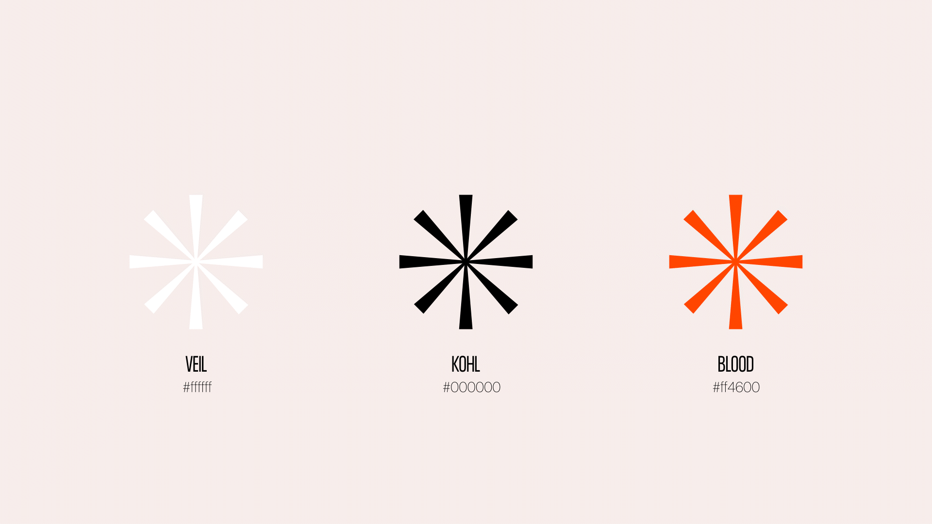
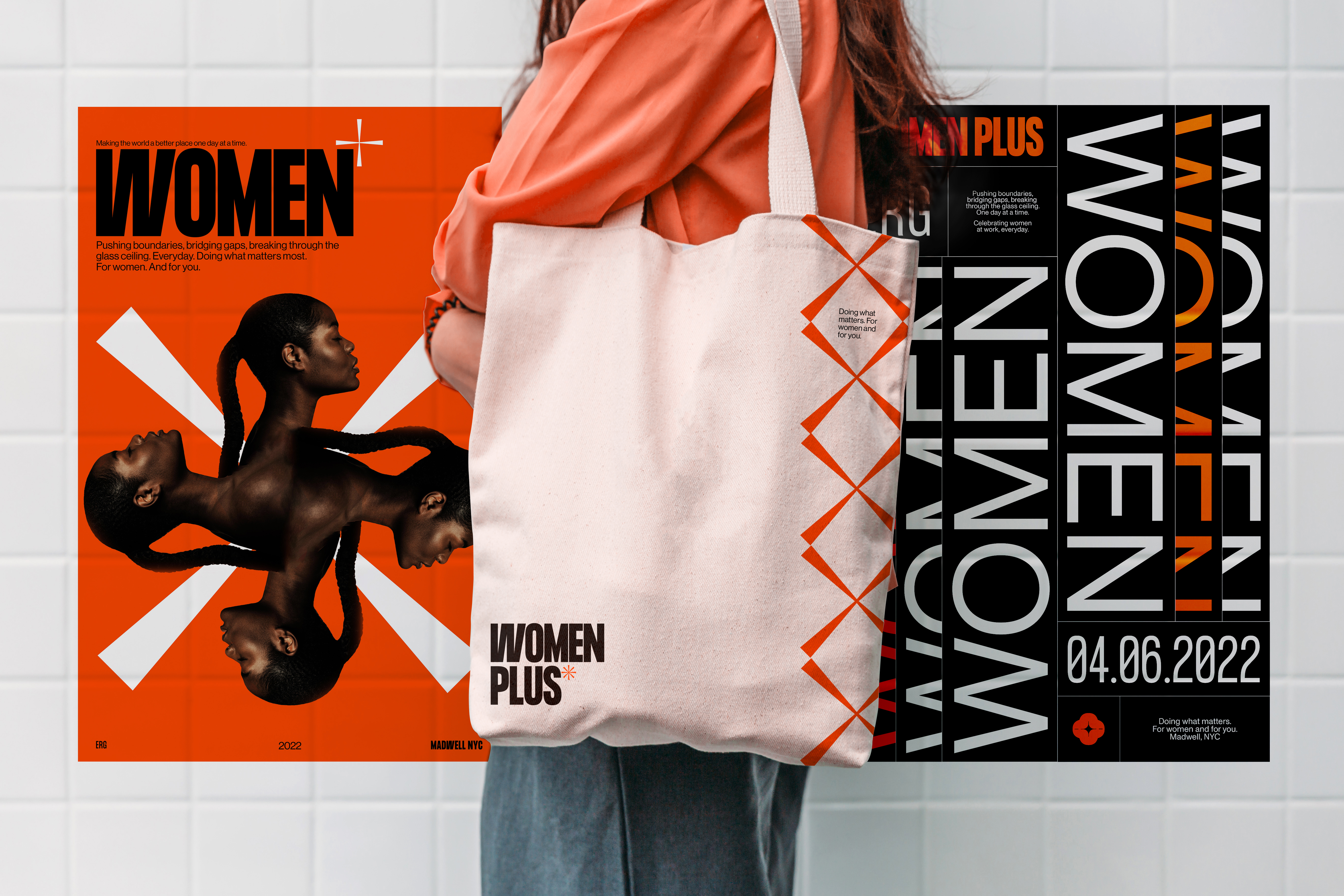
The concept of womanhood is broader now than it ever has been.
Resisting centuries of pigeonholing and pressures to conform, women today embrace their diversity, strength, and right to a seat at the table.
This pro-bono project at Madwell, NYC was my attempt to represent women as the multi-faceted and adaptable lot that we are! Using variable typography and a vivid color palette, I strove to create a versatile system ready for expansion across media.